Services: Identity, Logotype & Mark, Print Collateral, Packaging, Direction & Design: Georgia Harizani, Printing & Packaging: Xenos Printing, Papers: Perrakis Papers, Presentation: Achilleas Kazamias, Photography & Direction: Stefanos Tsakiris
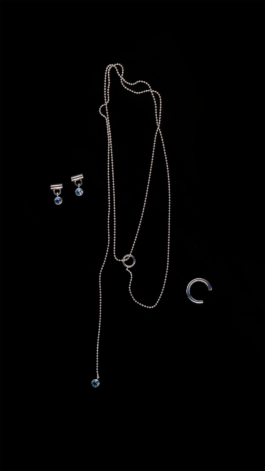
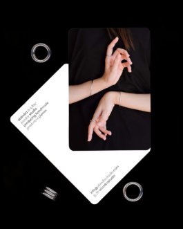
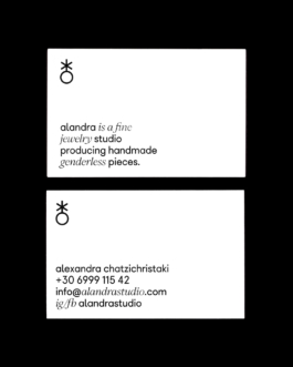
alandra is a fine jewelry studio producing handmade, genderless pieces. Our approach to its identity mirrors the brand’s ethos; timeless, intentional, and quietly expressive.
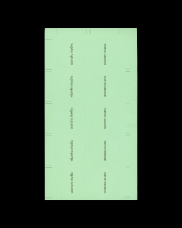
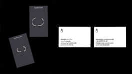
The logotype itself is a statement, extending into a full sentence that defines the studio’s philosophy. This typographic approach not only sets the tone but also creates a distinctive, memorable presence. A shorter version, “alandra studio,” provides versatility across applications.
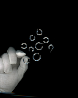
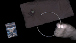
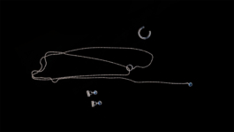
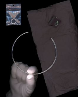
At the heart of the visual identity is the mark, a subtle yet powerful symbol that reflects the genderless nature of the brand. Its form gently references both the male and female icons, while also alluding to a ring, an elegant gesture that connects symbolism with craft.
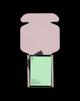
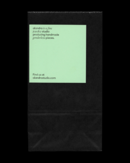
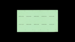
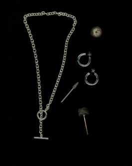
The visual language is refined and tactile, featuring a single, pale green hue that lends a quiet freshness to the identity. This soft color, used sparingly, enhances the feeling of calm clarity while allowing the jewelry’s craftsmanship to remain the focal point.

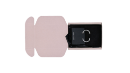

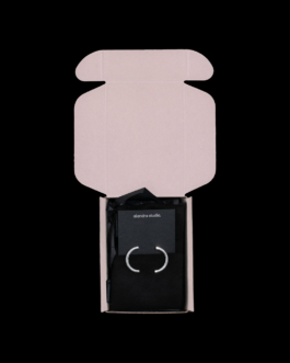
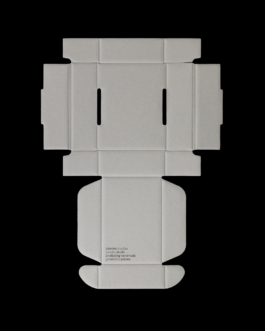
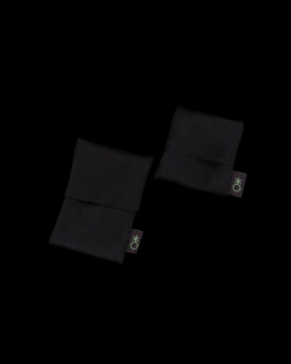
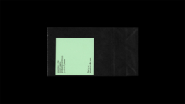
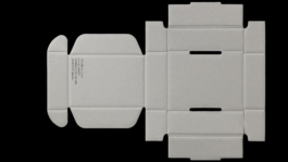
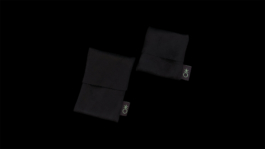
Carefully selected materials and textures elevate the tactile experience, with print collateral designed to blend seamlessly with the product—balancing softness with structure, and texture with refinement.
The result is an identity that feels natural, honest, and effortlessly sophisticated just like the pieces alandra creates.

Services: Identity, Print Collateral, Packaging, Direction & Design: Georgia Harizani, Printing & Packaging: Xenos Printing, Papers: Perrakis Papers, Presentation: Achilleas Kazamias, Photography & Direction: Stefanos Tsakiris
alandra is a fine jewelry studio producing handmade, genderless pieces. Our approach to its identity mirrors the brand’s ethos; timeless, intentional, and quietly expressive.
The logotype itself is a statement, extending into a full sentence that defines the studio’s philosophy. This typographic approach not only sets the tone but also creates a distinctive, memorable presence. A shorter version, “alandra studio,” provides versatility across applications.
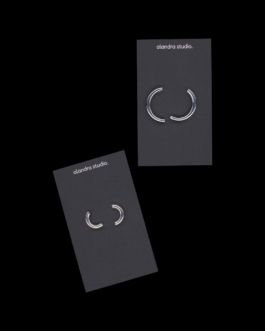
At the heart of the visual identity is the mark—a subtle yet powerful symbol that reflects the genderless nature of the brand. Its form gently references both the male and female icons, while also alluding to a ring—an elegant gesture that connects symbolism with craft.
The visual language is refined and tactile, featuring a single, pale green hue that lends a quiet freshness to the identity. This soft color, used sparingly, enhances the feeling of calm clarity while allowing the jewelry’s craftsmanship to remain the focal point.
Carefully selected materials and textures elevate the tactile experience, with print collateral designed to blend seamlessly with the product—balancing softness with structure, and texture with refinement.
The result is an identity that feels natural, honest, and effortlessly sophisticated just like the pieces alandra creates.